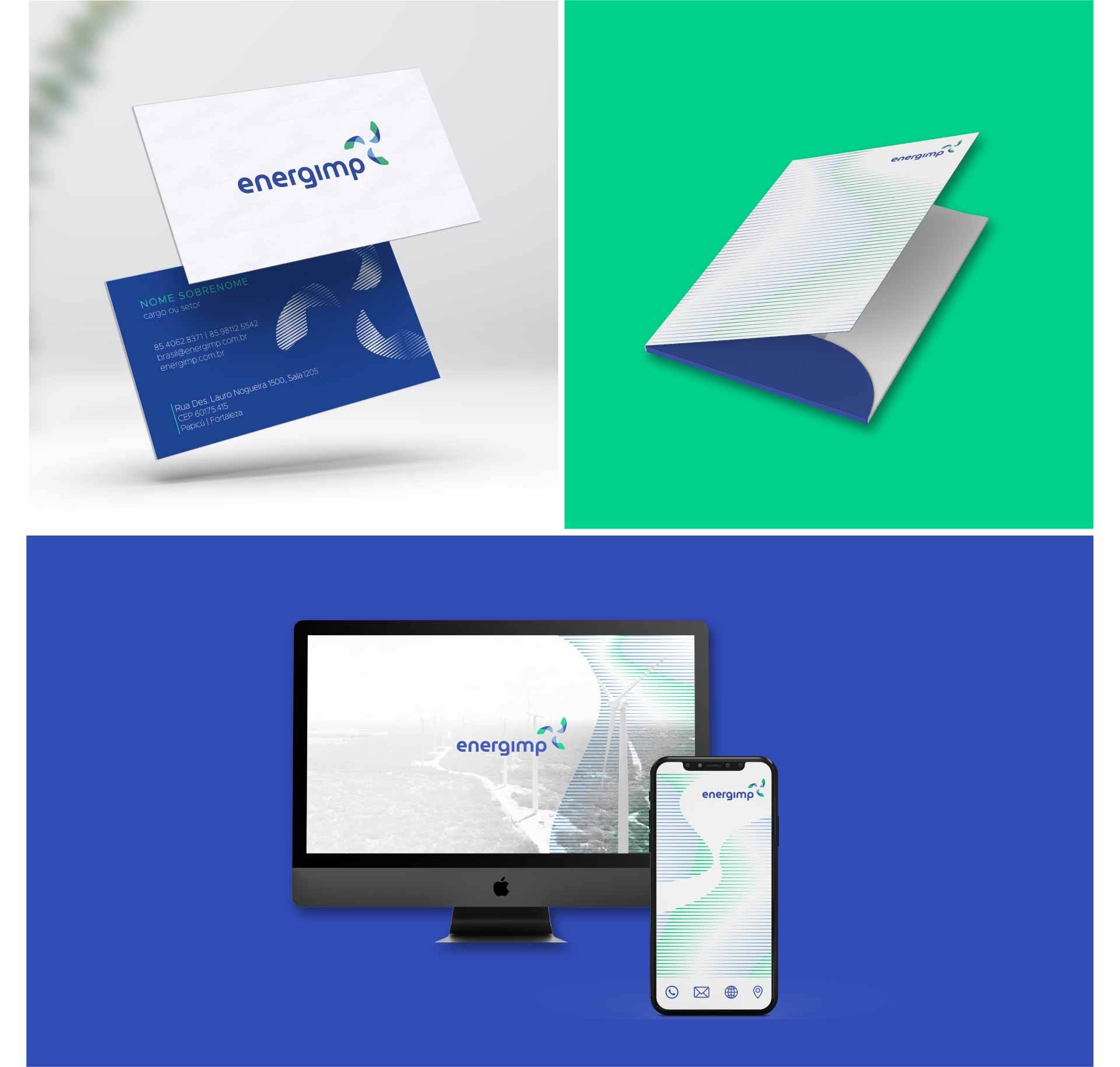
Energimp, established in 2000, operates with the capturing and transmission of wind power. Powered by the force of the wind, the company isn’t afraid of changes, nor of challenges. Working with renewable and clean energy means thinking about sustainability and, necessarily, looking towards the future. With 20 years’ experience, Energimp had the courage to ask itself: what do we want to build for ourselves (and for the world) from now on? Reviewing and transforming practices, habits and concepts is critical for those who wish to continue on this business path. Thus, the company agreed to undergo a profound renovation, which involved everything from its branding to its visual identity.
Strategy
The initial kickoff was a survey to understand the internal (culture identification) and external (benchmarking) environments. Based on this, it was possible to develop a diagnosis and define the communication and visual identity guidelines.
As part of the rebranding work, we reviewed the company’s values and purpose, aligned to this new moment: modernity without losing the essence! Energimp now enters a new era of greater protagonism, diversity and experience.
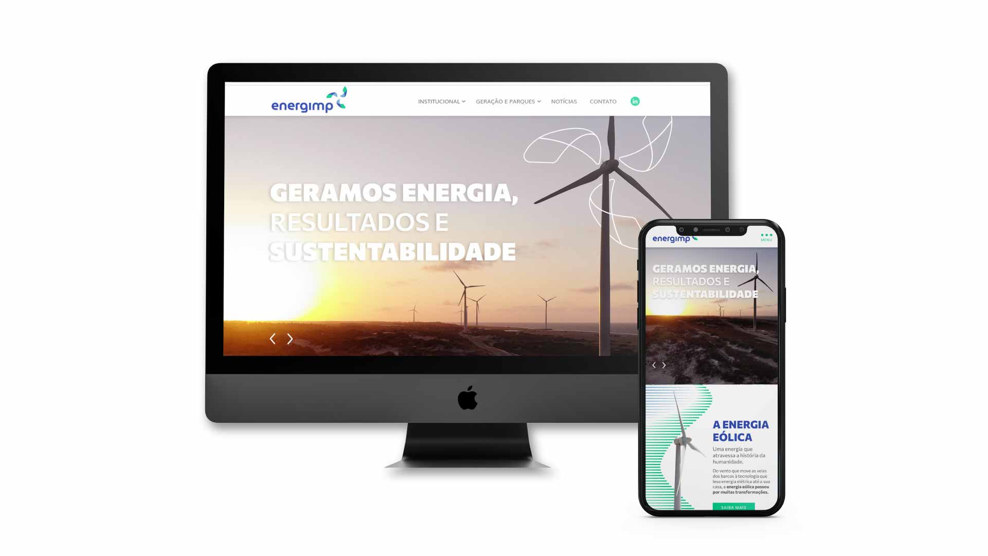
Then, it was time to start creating the new logo and website, which synthesize everything that was built during the previous stage.
Criação
O logo da Energimp remete ao principal símbolo da empresa: as pás das turbinas e a rotação dos aerogeradores. Uma referência clara à energia eólica.
A escolha das cores foi feita com base na análise da área de atuação: o azul carrega em si a simbologia do ar, enquanto que o verde é uma cor que representa a tecnologia e sustentabilidade . A marca traz a leveza do recurso eólico e do céu.
A tipografia utilizada foi a Museo Moderno. Ela agrega presença e força à marca, de modo a afirmar a autoridade da Energimp sobre o assunto da energia eólica, transmitindo credibilidade aos clientes. O uso da fonte também faz referência à tecnologia pelo uso de traços ortogonais e círculos perfeitos.
