APTAH is a virtual bioinformatics laboratory that develops new drugs and molecules (which will serve as an active ingredient for new drugs), with expertise in Drug Design – development of new molecules.
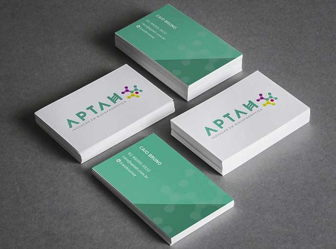
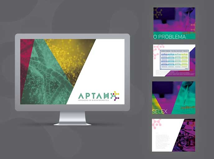
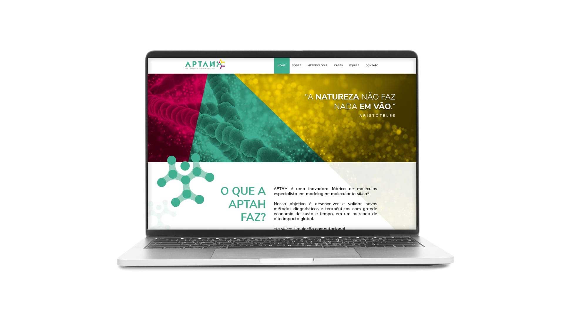
The visual identity needed to be done in a way that is consistent with the company’s branch – modern, technological and seeking knowledge. In this sense, the chosen typography contains well-marked angles, which makes people run the entire length of the brand with a glance. The intervention in the caractere was added to the symbol which refers to the area of operation, while the elected colors convey the air of innovation.


